

Currency Converter + atm locator App
Timeframe
February - May 2024
Project Goal
I’m creating an app that helps global travelers find an efficient way to exchange and attain currency when abroad. We need to find if the main user experience of our currency calculator and ATM locator is easy to navigate.
The target audience
Global travelers that need to exchange money abroad
Key challenges and constraints
Simplifying the app/product
Trying to appeal to a wider audience
Research conducted
6 initial interviews - empathy map
5 lo-fi usability studies
5 hi-fi usability studies
Initial concepts
For the user, I was trying to solve where they would get the money, let them know how much money converted over from their original currency, and I wanted to help the traveler avoid being scammed through reviews from other users.
Design Strategy
Create an application with an ATM Locator and Money converter as a main feature. The user would have the ability to rate a good or bad experience to promote transparency and help manage the locations where they would exchange their money
PERSONAS based on initial user interviews
Melissa Garcia

Age: 26
Education: Bachelors of Science
Hometown: Maracaibo, Venezuela
Family: Married, pregnant
Occupation: Military, Active Duty
Mental/physical abilities: 1st pregnancy
Gender: Female
Race: Venezuelan American
Goals
Get money exchanged as soon as possible when I get to my destination
Be able to freely/easily navigate local areas without worrying about not having enough cash on hand
Frustrations
Likes to visit local areas, but they usually accept cash only and there’s a larger language barrier in these areas
Has trouble with the language barrier, would be helpful to have the cashier show the amount paid on the register or if I knew the number in that language or indication of coins or dollars to use
Story
Melissa Garcia is a 26 year old active duty service member from Venezuela, she’s married and has a baby on the way. When they reach their destination they like to get their money exchanged as soon as possible to deal with their necessities. Her and her husband like to explore their childhood home / local areas without worrying about not having enough cash on hand for local vendors or the like. With Melissa being a new mother soon, she stresses when going on trips and to try to lighten the stress she has to do thorough preparation prior to traveling. Her other biggest concern is that she is able to return home with the least amount or no foreign currency in her pockets.
“When you’re doing local things, you won’t be haggled by people because they think you’re a tourist. also less crowded usually to go to”
Nana Braxton

Age: 51
Education: Bachelors, Public relations
Hometown: Yonkers, NY
Family: Married, four kids, two at home
Occupation: Risk associate for bank
Mental/physical abilities: Undiagnosed OCD
Gender: Female
Race: African American
Goals:
Find a very strong currency rate/competitive with the bank, and for it to be updated real-time or at least daily
Preferably would like to use card as much as possible, before having to use cash, would like to know the places that do
Frustrations:
Likes to visit local areas, but they usually accept cash only and there’s a larger language barrier in these areas
Has trouble with the language barrier, would be helpful to have the cashier show the amount paid on the register or if I knew the number in that language or indication of coins or dollars to use
Story:
Nana Braxton is a 51 year old African American mother of four from Yonkers, New York. She works as a risk associate for a bank and travels every 4-6 months with her family or with a group of friends. Since she travels with a group, she finds it important that she needs to find a strong/competitive currency rate that is updated real-time or at least daily to exchange her money. She prefers exploring the local areas but she has a bit of trouble with the language barrier when it comes to purchasing things, it would be helpful to have the cashiers show the amount paid or if she knew the number in the language necessary. When she purchases anything she prefers to use her card over cash, but she also finds it a little hard to do that when she’s in a local area that tend to rely on cash purchases.
“It’s definitely why I prefer to figure out if an airport has an ATM, I don’t need to talk to anybody, I’m already in that space, I don’t have to find anywhere. If I don’t know the language and I have to figure out those things, it’s tougher.”
Eric Chen

Story:
Eric Chen is a 32 year old unmarried Electrical Engineer who lives and takes care of his parents. He’s prone to get anxious thoughts and plans things carefully when he travels to places like Taiwan. Eric travels at least once a year and is a very cautious person. When he travels, he would like to know if the places he visit are legitimate, have good reviews and would like to verify if he’s getting a good service. In the past he’d been scammed by locals a couple of times, by paying too much because the currency rate wasn’t clear. Eric is also a man of convenience, so if he needs cash he would like to find an accessible ATM at a pharmacy, restaurant or local shop. It would be ideal to make sure where he is going is safe and that there’s a lesser chance of getting scammed.
“That’s why my approach is this way, [scam] I ask for directions, they took me to a wrong place, then taken to the right place for money…”
Age: 32
Education: Graduate degree
Hometown: San Antonio, TX
Family: Single, unmarried, mother’s caretaker
Occupation: Electrical Engineer
Mental/physical abilities: Anxiety
Gender: Male
Race: Taiwanese
Goals:
Find a legitimate place with good reviews, that will be less likely to scam; means to verify it’s a good service
He needs to find an ATM at convenient spots if he’s going to get cash, pharmacy/restaurant/ local shop
Frustrations:
Wants to make sure where there going is safe, that they won’t be scammed or would like to know how likely they will lose money
Have been scammed before, and have paid more than they needed to because the currency rate wasn’t clear
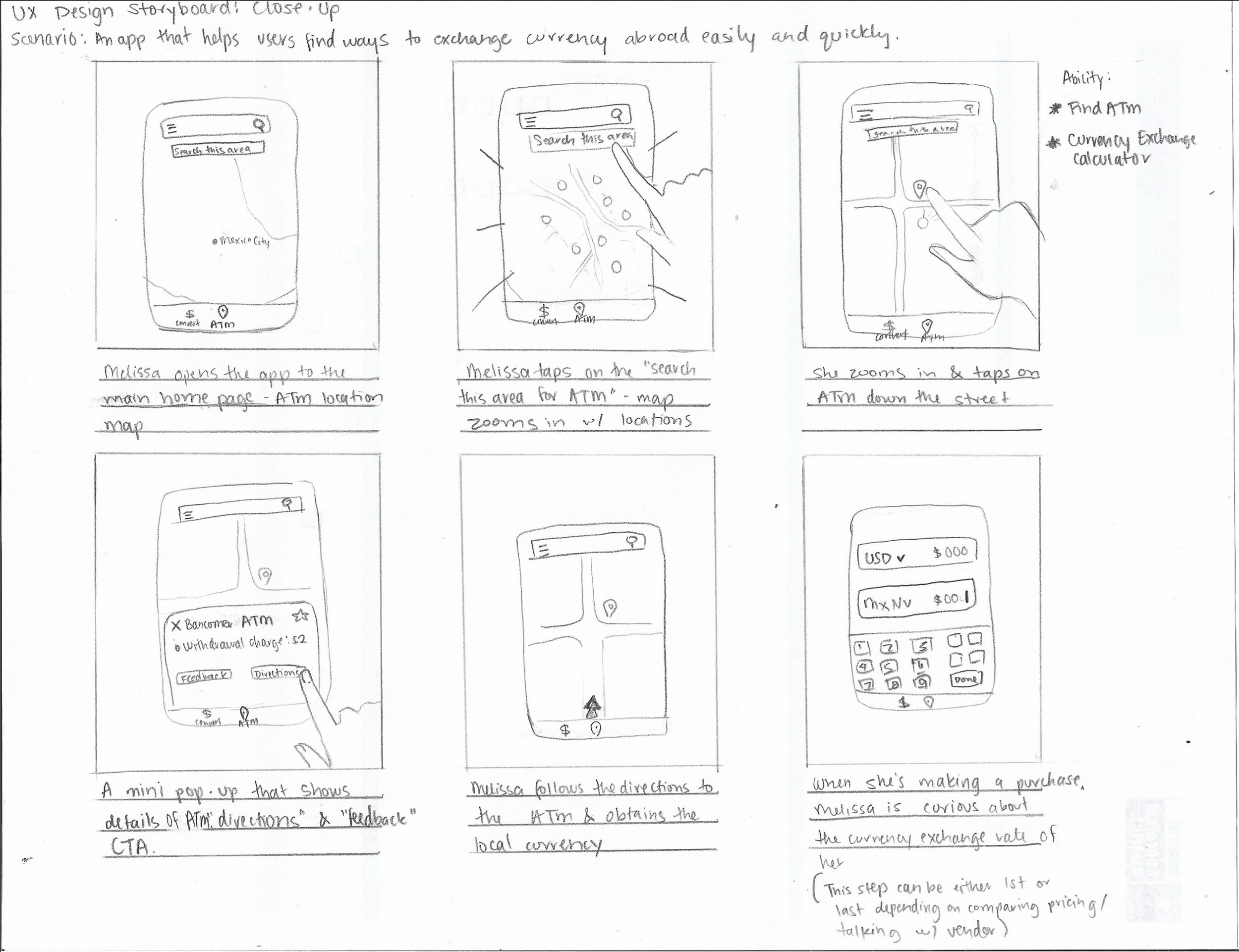
Rapid Sketching & Crazy Eights


Storyboard: Big Picture and Close Up

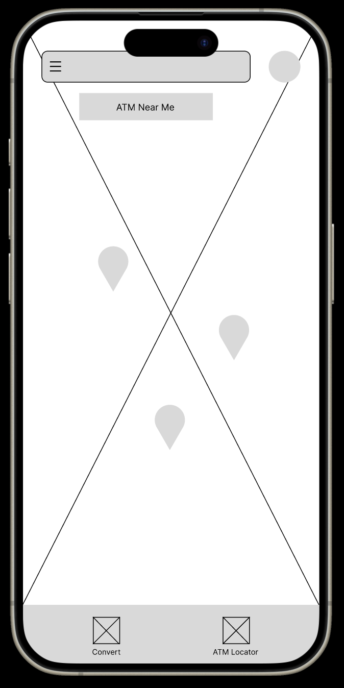
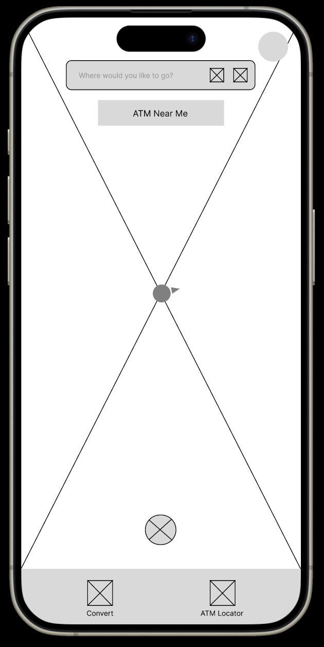
LO-FI WIREFRAMES

LOW FIDELITY PROTOTYPE
USABILITY STUDY
Research Questions
If it is useful, when would the user use the currency calculator when wanting to exchange money?
What filters would help locate their type of ATM?
What do they expect in their settings menu?
How can I make this accessible to blind / deaf/hard of hearing
What kind of “feedback” are we expecting to get from the ATM?
How many filters is enough? Or helpful?
Participants
4 males, 2 females between the ages of 20 to 74.
One participant is hard of hearing/uses hearing aids.
Participants are people who have traveled abroad at least once
Methodology
Moderated Usability Study
Each session lasted 30 minutes to 1hr and would include an introduction, a list of tasks
Location: United States, Remote (participants will go through the usability study in their own homes on an interactive lo-fi prototype, through Google meeting, webcam /presenting screen)
AFFINITY DIAGRAM
User interview data was grouped in common themes to come up with insights and updates on next version of low-fidelity wireframes and then to the hi-fidelity prototype.
RESEARCH INSIGHTS
Based on the theme that: the three line hamburger menu is difficult to find for almost all users or proves to be confusing, an insight is: I need to design a more recognizable symbol or icon for the filter
Based on the theme that: the currency conversion would be used in a variety of activities outside of travel, an insight is: my app could be used outside of just travel, including online shopping, daily grocery shopping, or business opportunities.
Based on the theme that: half of the users want transparency and trust from our application, an insight is: make the user feedback available for the other users to see.
Based on the theme that: most of the users want options to choose from for feedback, an insight is: they want a quick and easy way to handle their feedback and don’t want to take the time to comment unless it’s a big or specific difficulty.
Based on the theme that: there were interactivity issues with the prototype, an insight is: I need to make the interactions smoother for a more intuitive experience.
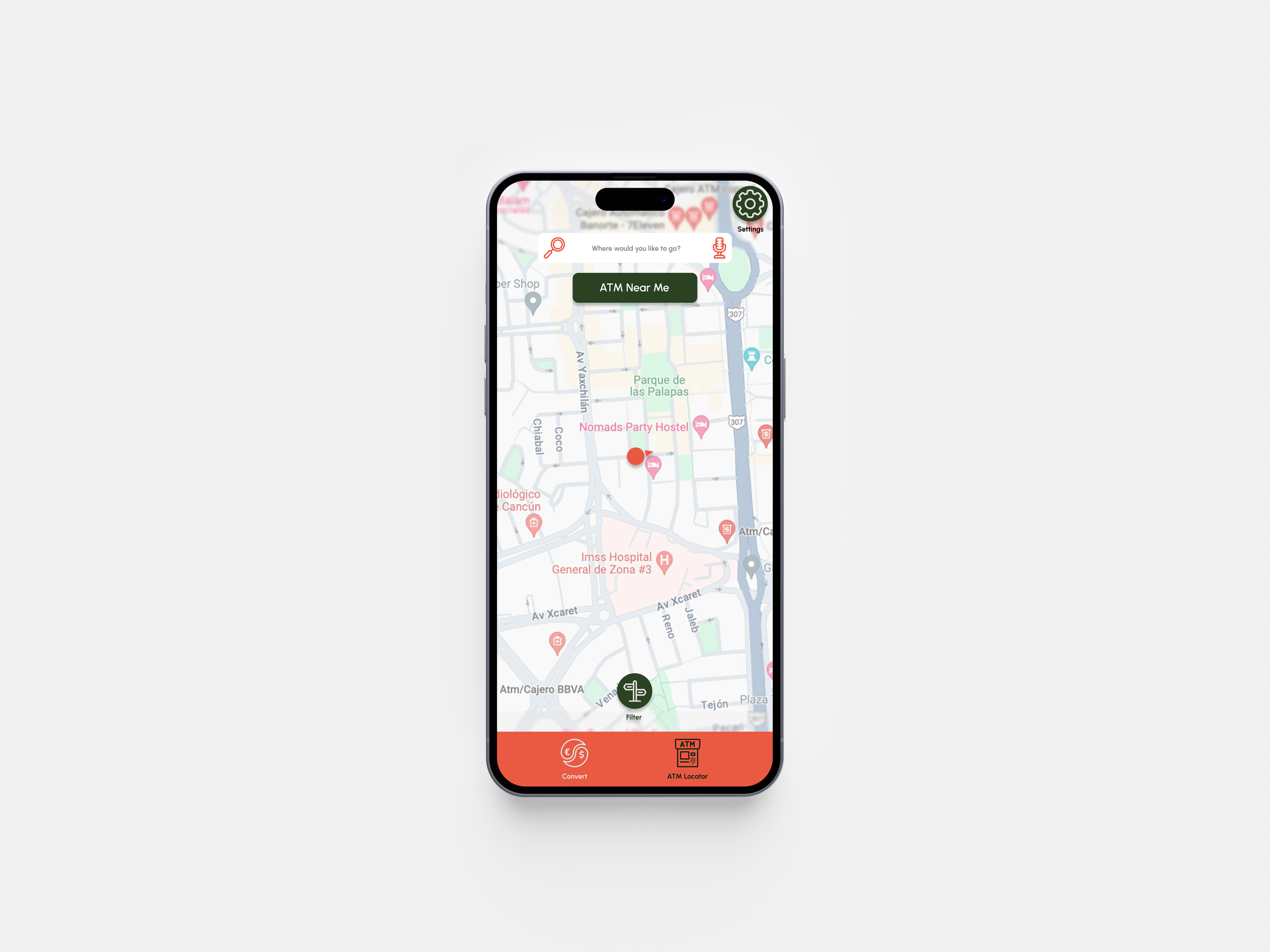
Based on the theme that: my participants had an easy time finding an “ATM near me”, an insight is: I need to keep that button available in the final prototype and make my location pinpoints clear as well as the position the user is at.
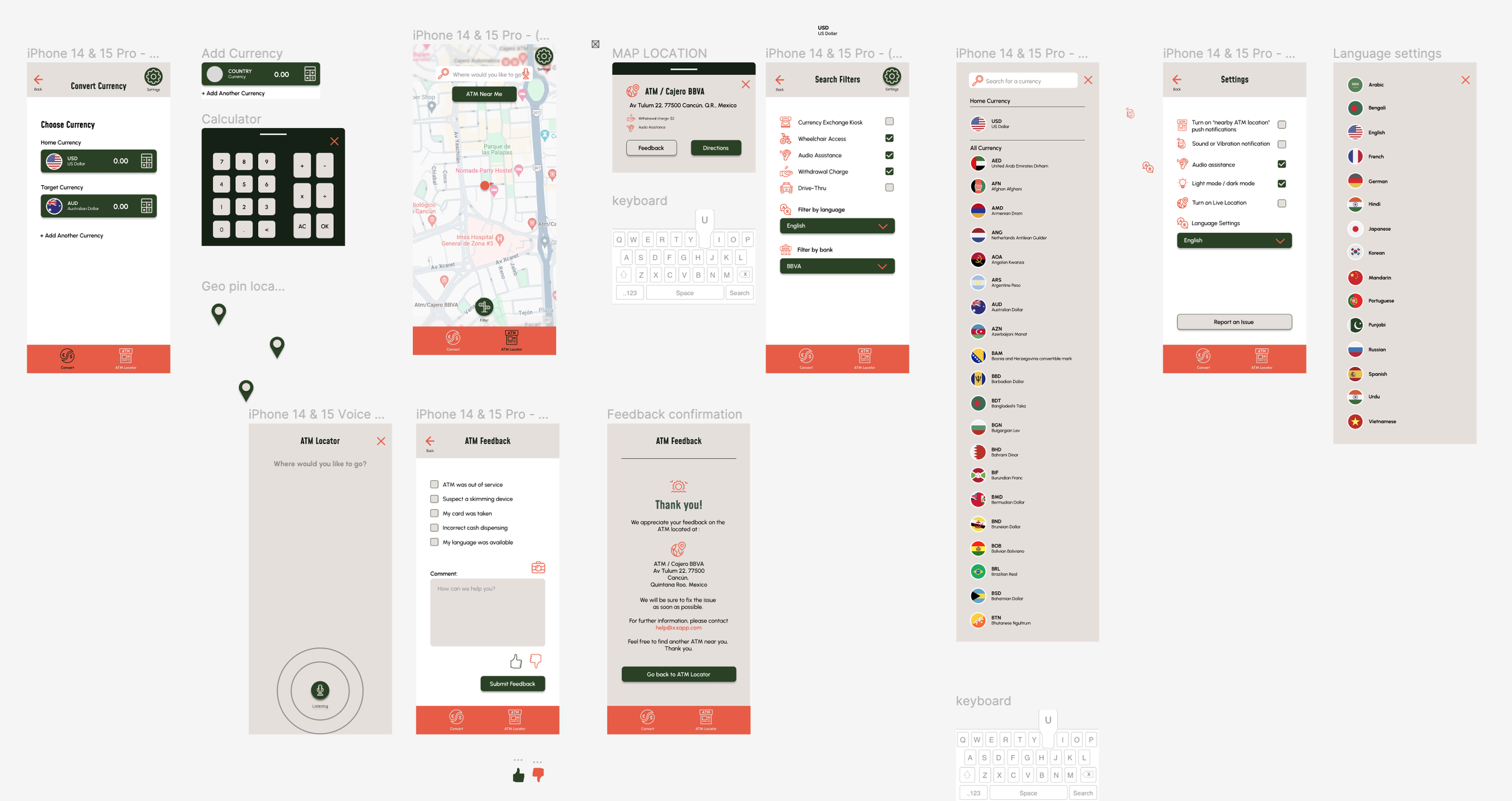
atm locator SCREEN
Filter Button Updates
Filter - I’ve changed the location of the filter from the search bar to bottom central near navigation
During my usability study 5 out of 6 users struggled to find the filter button
A few stressed that they would like to have access to the filter before they search, so I placed it in a more obvious area.
I plan to have a better symbol/icon to symbolize the filter button during my visual design journey
When I gave my users the task to find an ATM “near me” about half of them couldn’t locate themselves first, so I made sure to add a cursor for their own location.
LO-FIDELITY PROTOTYPE
Hi-fidelity prototype
Hi - Fidelity Mock Ups
Usability Test 2 on Hi-Fidelity Prototypes
Affinity Diagram