
ECI SOLUTIONS
WEB DESIGN | UI/UX
ROLE
Web Designer
DIGITAL & CREATIVE TEAM
Victor Camara, Samuel Austin, Steve Neumeier, Nathan Rich, Kendra Mitchell
OVERVIEW
Industry leading cloud-based business management software for multiple industries. To help small and medium-sized businesses compete and grow by providing industry expertise and purpose-built solutions that make doing business easier.
WEB PROJECTS BELOW
Resource page redesign (WORK IN PROGRESS)
INTRO:
The resource page allows the user to look into related topics that surround their selected product.
CHALLENGE:
Resource page is one of 5 top visited pages but not a lot of resource tiles are easily accessible.
Currently have a horizontal scroll that displays 5-7 items at a time. You can filter by category/type but filtering by industry or product may be more relevant to the users. Our current solution is Pathfactory, it has very focused content streams.
SOLUTION:
Implement a vertical scroll (9 tiles) with pagination; so that more tiles are seen and pagination lets the user know how many pages to go through. Resources will be pre-filtered by industry page/product page so that the user can focus on the type (case study, video, etc.) This simplifies the process of searching and reduces possibility of bouncing from page. Filter will be located on the left so that it is always accessible. On the corporate page, user will be able to access high-level. We incorporated a zoom-in interactive feature to the tiles to catch the user’s attention and to entice the user to look into the resource details
On mobile, instead of check boxes, we are switching to a drop down function so that the user has an easier time choosing their filter.
RESEARCH/REFERENCE:
Qualtrics, FormStack, Rydoo
USER FLOW:
HIFI WIREFRAME/PROTOTYPE

CONCLUSION:
More resource tiles are viewable, users know how many resources are available, tiles are pre-filtered depending on industry/product and don’t have to deal with other industry/products they aren’t interested in.
AFTERTHOUGHTS:
PREVIOUS DESIGN
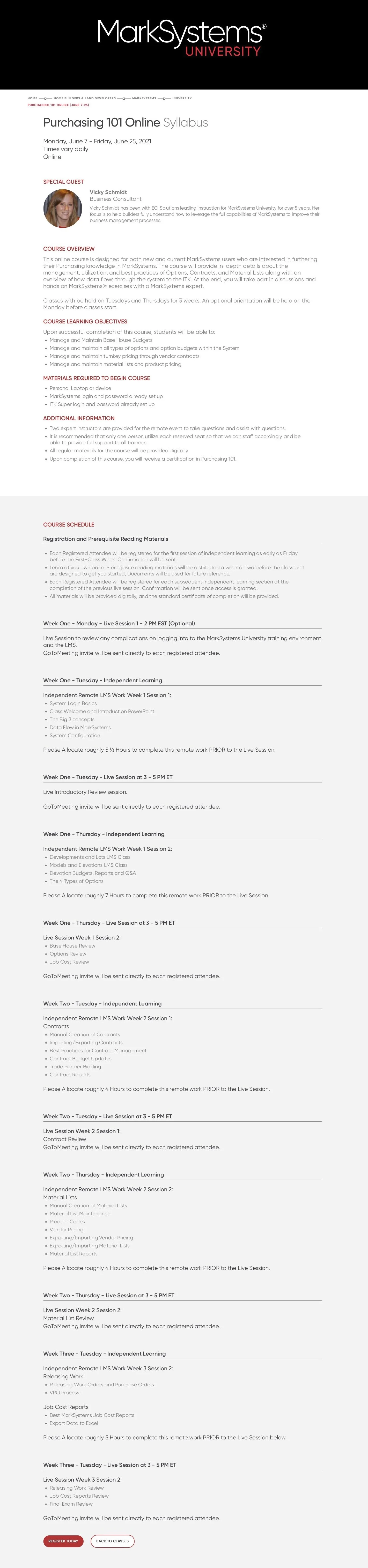
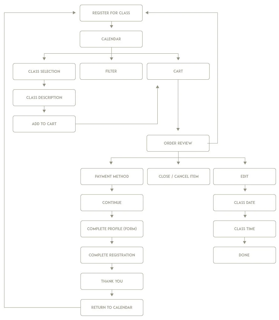
MANUFACTURING TRAINING PAGE – CALENDAR CLASS
INTRO:
The Manufacturing Training Page was a program that offered our clients classes to train their employees on the M1 product. They had the ability to choose from different sets of classes scheduled throughout the month.
CHALLENGE:
Information on the page is really spread out and hard to coordinate if you want to take multiple courses. Course overview and class date information is separated, with the CTA at the bottom of the page.
SOLUTION:
Create classes organized within a monthly calendar format to keep the information viewable all at once. Opens up the opportunity for them to sign up for multiple classes, rather than just one course at a time.
RESEARCH / REFERENCE:
I used calendar schedules like Microsoft Teams as my influence for my design, to give the user courses at a glance.

PREVIOUS DESIGN
USER FLOW
HIFI WIREFRAME/PROTOTYPE:
CONCLUSION:
Class information is presented in a more compact/concise manner, an easier way to schedule classes, ability to schedule more classes at once.
AFTERTHOUGHTS:
I would have re-designed the Order Review section. The hierarchy is a little confusing and it should be more apparent that you could edit class times and dates in that section. Our color palette is very limited. I would have wanted to bring in more of our secondary colors to freshen up the calendar. Word legibility is a bit hard on mobile, I would have tried a vertical weekly calendar for mobile vs. the monthly calendar view on desktop.
COOKIE BANNER
PROJECT OVERVIEW
The goal for creating the cookie banner was to improve the user interface and user experience accessing the Cookie Policy. I designed a mobile version to support the responsive website.
PROBLEM SOLVING
Designed the cookie banner to be minimalist; a way to access your preferences or a quick way to close it out with ease.
Created a few variations of the modal dependent on different regions legal policies, to allow the user to customize their cookie preferences .
Following brand guidelines and ADA (Americans with Disabilities Act) Compliance, the CTA buttons would be a red to show emphasis and readability.


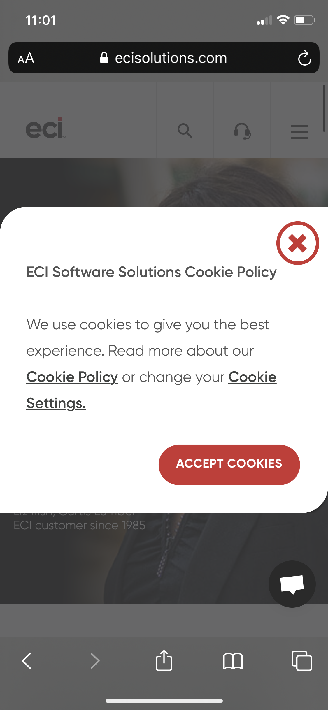
INTERACTIVE PROTOTYPE
On the website, the banner pops up as a modal for a first time user to the site.
The user can customize their preferences from the dropdown and clicking on the switch.
If the modal is closed, the user can access it through the Cookie Policy link at the bottom of the page.
ERP ASSESSMENT TOOL
PROJECT OVERVIEW
Re-branded the ERP Assessment tool to help prospects decide if the products, JobBOSS or M1, is a better fit for them. The undecided customers will be sent to Business Development Representatives after taking the quiz. This will be used in nurture emails and on the website as a lead or contact conversion tool.
PROBLEM SOLVING
The ERP Assessment Tool was re-branded with the new, minimalist ECI branding guidelines;
The radio buttons were replaced with a cleaner design to match the branding.
To show the user they are advancing, I created a more accurate progress bar by adding the current page number over the total page number.
Improved the UX flow by adding the customer’s answer results at the end of the quiz and emailing them for later use.
The back button at the top left allows the customer to change their answer during the quiz.
PREVIOUS DESIGN


CURRENT DESIGN


INTERACTIVE PROTOTYPE - WEB
Choose your answers by clicking on the radio buttons, the red check proceeds the user to the next question.
Question 5 expands to a secondary question if the user chooses the second answer.
See advancement through the progress bar at the bottom of the quiz.
The client inputs their information to receive their results and receive further help from a company representative.
The client can re-start the quiz by clicking the “x” on the top right corner.
ERP ASSESSMENT TOOL - MOBILE
The biggest difference between Web and Mobile is the progress number switched from bottom left corner to above the question to let the user know what question they are on at a glance.
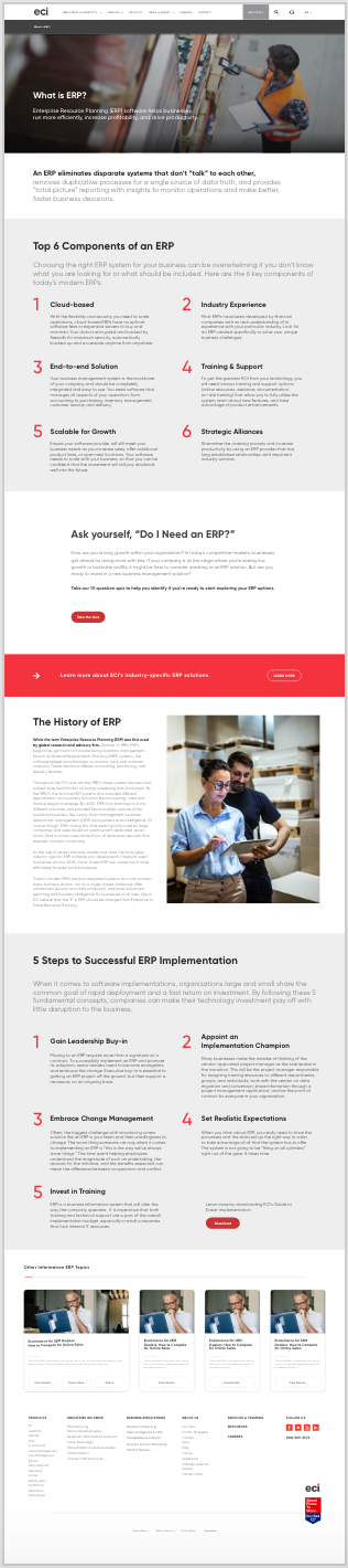
WHAT IS AN ERP
PROJECT OVERVIEW
The page was built to help out future customers determine the need for an ERP product.
PROBLEM SOLVING
To promote and improve search engine optimization (SEO) for the page,
I placed the information in lists to inform the customer of the components and implementation for ERP.The definition was placed in the hero image to highlight initial understanding.
Color blocks and white space were used to differentiate the content sections and give them room to breathe.
The quiz lets the client decide if they need to purchase an ERP tool and contact a representative for further advice.